Me...Jane
Me...Jane
Marketing design for musical theatre
Marketing design for musical theatre
IBM Accessibility Experience Site
Project for
IBM Accessibility
Timeline
June – July 2021 (8 weeks)
My role
UX design:
research, ideation, content design, visual design,
testing, prototyping

How do we get
people to care about accessible design?
Most clients and developers are interested in improving accessible design.
However, they don't understand how people with diverse needs engage with their products.
IBM Accessibility tasked us, a team of UX design and research interns, with making it easier to use and promote the IBM Equal Access Accessibility Checker, an open source Chrome extension tool that helps developers and IBM clients assess the accessibility of their website.
Our solution
The bigger goal was to promote accessible design. We revamped the Accessibility Checker demo process to enable clients to gain understanding of the accessibility needs of their users in the first place.
#1
Experience assistive technology
enables developers & clients
to experience how assistive technologies work

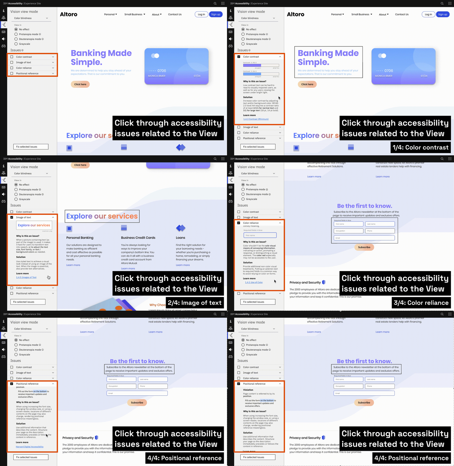
Flipping through different assistive technology "views"

Navigating through different "vision view" modes
#2
Learn about
accessibility violations
developers can learn about
high-impact accessibility errors & preview example solutions

Accessibility errors that relate to the vision view. Each view showcases different errors that pertain to the
respective assistive technology.

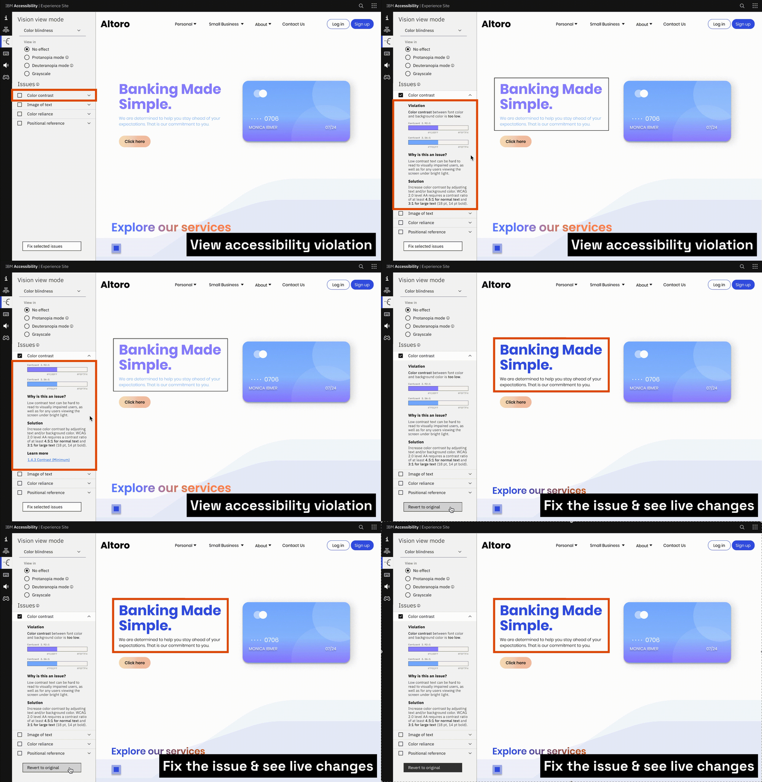
Reading about the accessibility violation & previewing the solution

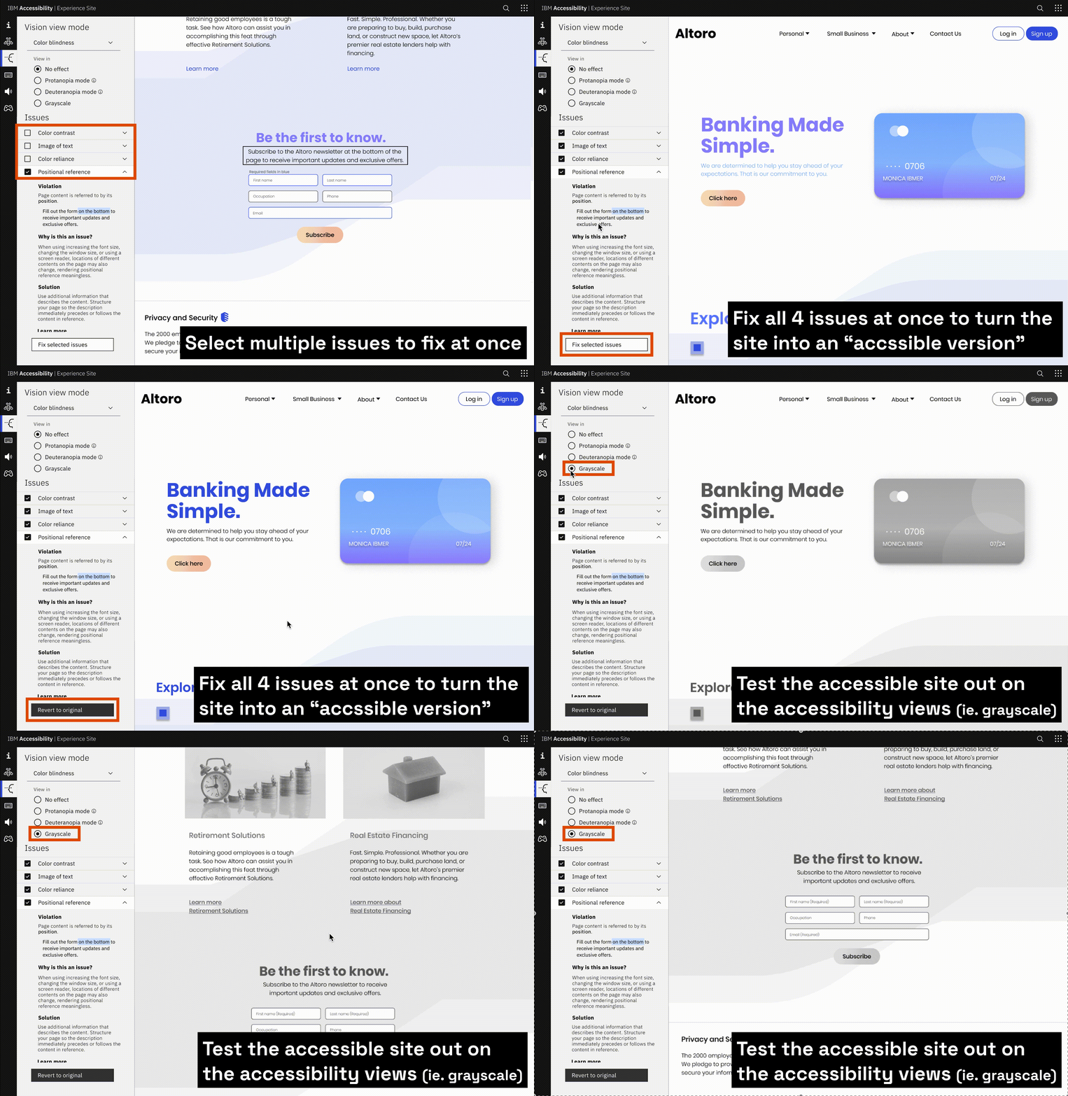
User can select & fix multiple errors, and test out the "accessible version" of the site within the view
#3
Test your knowledge
developers and clients can test their understading of assistive technologies in a gamified environment

Let's find out how we got here!
Current process
Outdated & unrelatable demo site

The dummy website that IBM Marketers used to showcase the IBM Accessibility Checker tool to developers and clients was outdated. Developers and external clients did not find the demo website relatable to their modern websites. They hesitated to incorporate the IBM Checker into their workflow.
Main problems:
-
The demo site looks & feels outdated
-
Features & accessibility issues are irrelevant
-
Client needs to download the tool to try it out
demo site
Chrome extension
Design brief
How might we show off the IBM Accessibility Checker in a way that appeals to potential users at a glance?
Research
After interviewing IBM's accessibility specialists for expert insights, we recruited “average developers” across business units with less expertise in accessibility to gauge what they know and how they learned about accessibility.
From the average developers, we learned that the developer community does care about accessible design, but still often leave it in the back burner. In the last round, we talked to more developers and marketers about factors that inhibit them from designing for accessibility.
Phase 1: What is the current state of accessibility in the industry?
Phase 2: What is the experience of designing for accessibility like for typical developers?
Phase 3: What are the current pain points in the workflow?
17 interviews, 12 users
User types
Through research, we identified two user types: developers who test their code with the checker, and marketers who help clients make their company’s products & processes more accessible by first assessing the client site with the checker.

Alex, developer
-
Developer at IBM's client company
-
An “average developer,” not well versed in accessibility
-
Wants to develop for accessibility, but prioritizes timeline

Andie, marketer
-
IBM employee working with external clients to help improve
accessibility of their products and processes -
Faces middle-management level clients
-
Promotes the use of IBM Accessibility Checker & other IBM
accessibility services
Research insights
Developers
“Most of us tend to be well-sighted. We can understand things very clearly.
… we make certain assumptions about [disabled users’ perspective]
that maybe don’t reflect reality."

-
Lack of incentives: Developers just want to get work done quickly. Lack of incentives, not lack of interest, inhibits them from learning about accessibility.
They just want to get the job done quickly. -
Lack of awareness: Accessibility errors arise because people don’t know what it’s like to use assistive technology, let alone design for it.
-
Lack of resources: Existing resources on accessible design are very dense, making it difficult for developers to begin learning about and incorporating it into their workflow.
Marketers
“[The checker] is great for developers and testers.
It’s a little bit harder if you’re trying to write a high-level overview.”

-
The tool is too technical: Marketers often talk to high-level executives and non-technical clients who are more interested in high-level overviews than nitty-gritty details.
-
The limitations of the virtual setting: It is even more difficult to learn about and build empathy for accessibility issues in working remote environments.
Shifting gears
Though the initial deliverable was a redesigned demo site, our research insights compelled us to first reexamine and expand our problem statement. This felt like an urgent prerequisite to improving the Accessibility Checker: What developers and clients need is not a simulation of various disabilities, but rather an awareness of accessible design and a core understanding of assistive technologies.
New problem statement
Developers and clients need a way to understand what it’s like to use assistive technology so they can build experiences that are accessible to everyone.
Ideation
Preliminary idea
We prioritized four design objectives that would successfully redesign the demo site as requested, while also applying new findings.
Our tool would:
-
Redesign the demo site with a more modern look & feel
-
Help users experience assistive technology
-
Make the Accessibility Checker results more digestible for non-technical clients
-
Promote the Accessibility Checker to potential users
At first, the team wanted to create a
two-portion site split into the redesigned demo site and a new “virtual empathy lab.”
showcases the Accessibility Checker as if run on an “accessible version” and “inaccessible version” of the same demo site
Demo site
Virtual empathy lab
activities that simulate the experiences of disabled users – i.e. a blurry website, keyboard navigation, etc

The side panel guides users through the accessibility violations and explains possible solutions. Scrolling down in the panel, users can also find additional resources or use the "Fix selected issues" button to envision the site after implementing the suggested solution. By doing so, they can immediately see and experience a more accessible version of the site.
Accessibility error prioritization grid
To pick out the accessibility issues to surface through the tool, I facilitated an ideation session with subject matter experts to gather insight on which accessibility errors were not only common, but also yielded a high impact. This is the result:
High
Impact
color
contrast
relying
on color
to convey
meaning
insufficient
ARIA
attributes
page
structure
Low
Impact
Key:
Pink/regular – vision
Blue/italicized – motor
Purple/bold – both
Uncommon
over-labeling
components
too many
navigation
links
unable to
pause
animations
tables
unable to
modify
font size
too many
ARIA
attributes
interactive
data tables
w many tabs
uncontrollable
time-outs
empty
form
labels
Common
heading
levels
link
text
small
click
targets
alt
text
mouse-
operable
components not reachable by keyboard
cognitive
disability
unclear
form
controls
Solution
After selecting high-impact accessibility violations, I decided to display various “accessibility view” options; for instance, the “screen reader view” allows users to experience a site with incorrect alt text or over-reliance on colored text.
This layout condensed the experiences of learning about accessibility violations and trying out their respective assistive technologies into one seamless experience.
Accessibility views
Vision view: simulates the experience of viewing the demo site with different visual impairments, including color blindness, and enables user to try out different light sensitivity and font size adjustments
Keyboard navigation view: blocks out mouse / trackpad use and guides user through navigating the demo site using the keyboard only, using keyboard navigation controls
Screen reader view: greys out the demo site and forces user to navigate through the demo site only hearing the screen reader and using screen reader key commands
1)
2)
3)
showing the side bar interactions through the "views"
digging into the vision view
demonstration of the error panel features in the vision view
Interface goal #1:
Screen reader view


The screen reader view hides the demo site, encouraging users to rely only on audible guidance and screen reader keyboard commands. Users can use the toggle to turn the demo site back on to learn more about these specific accessibility issues.
Keyboard navigation view

Mouse operable components not reachable by keyboard

Keyboard trap

Mouse operable components not reachable by keyboard

Keyboard trap

Mouse operable components not reachable by keyboard

Keyboard trap
The keyboard navigation view disables mouse use, prompting users to navigate the site using only keyboard navigation operations.
Interface goal #2:
Vision view


The error panel points out the accessibility violation regarding color contrast

After clicking the "Fix selected issues" button, the color of problematic text changes to ensure adequate contrast

The error panel points out the accessibility violation regarding color contrast

After clicking the "Fix selected issues" button, the color of problematic text changes to ensure adequate contrast

The error panel points out the accessibility violation regarding color contrast

After clicking the "Fix selected issues" button, the color of problematic text changes to ensure adequate contrast
The side panel guides users through the accessibility violations and explains possible solutions. Scrolling down in the panel, users can also find additional resources or use the "Fix selected issues" button to envision the site after implementing the suggested solution. By doing so, they can immediately see and experience a more accessible version of the site.
Additional views
We also added a gamified educational tool to prompt playful learning and test users’ understanding of the material. Last but not least, I designed a “checker view” to both serve as a natural transition to promoting the checker and output a one-page summary of URLs users input to get a simple rundown of their website.
Educational game view: Users can time their performance carrying out a simple task (ie. checking bank account number) in keyboard navigation or screen reader modes
Checker view: Viewer can see and interact with the Accessibility Checker output without needing to first download it
Interface goal #3:
Educational game view


Landing page

Completing the task of checking account balance using keyboard navigation

Landing page

Completing the task of checking account balance using keyboard navigation

Landing page

Completing the task of checking account balance using keyboard navigation
Interface goal #4:
Checker view

In the Checker view, users can interact with the output of IBM Equal Access Accessibility Checker as run on the demo site, allowing potential users to preview the tool without needing to first download it.
1-page summary

After interacting with the tool’s interface, users are prompted to enter in their own URL for a quick, one-page summary containing high level information about the state of accessibility for their websites. This PDF output can serve as a resource that IBM marketers can pass onto their non-technical clients.
Next steps
Short term goals
-
Add more violations: working through a list of all high-impact accessibility violations
-
Add an FAQ section: to further help developers implement accessibility into their workflow
-
Award external incentive: awarding "Think 40" credit to incentivize internal IBM users to gain awareness and start developing for accessibility
Long term goals
-
Allow interaction with custom URLs: Users can input any website to replace the demo site. The checker will output violations and AI-generated suggestions.
-
Add additional views: stimulating a wider range of assistive technologies, such as sip n puff or tools used by people with cognitive disabilities.
Takeaways
It’s ok to ideate early. If you have an idea, prototype early.
I thought of the idea of using an "accessibility experience site" early on, but was afraid of landing on an idea too early. Feeling stuck in one idea, we paused and took extra time to brainstorm, which ended up putting us in a time crunch to design and prototype after we eventually decided to move forward with an analogous "assistive technology experience site." If I had a chance to redo the project, a better approach would have been prototyping with our original idea while conducting brainstorming sessions on the side — buying more time to test, validate, and increase the fidelity of our final prototype.
Test with users with disability
If there's one thing I learned from this process, it's important to design with disabled users when coming up with accessibility solutions. We were running with limited time and resources, but an testing, ideating, and designing solutions with people who use assistive technology day to day was a crucial step we missed in this project.
Teamwork does make the dream work.
Not to end on a sappy note, but I was really lucky to have my team of talented designers, a design coach that kept us on track with meticulous feedback, and an incubator team that trusted us and let us sidetrack even when a feasible solution was not in sight. Coming from a job comprised mainly of solo work, I am walking out of this intern project with full faith in the potential of good and supportive team dynamics :’)
Group picture with the dream team, Team Awesome Access, featuring our mentor Tim as our background. Much love.
